amp-web-push-widget button.amp-subscribe { display: inline-flex; align-items: center; border-radius: 5px; border: 0; box-sizing: border-box; margin: 0; padding: 10px 15px; cursor: pointer; outline: none; font-size: 15px; font-weight: 500; background: #4A90E2; margin-top: 7px; color: white; box-shadow: 0 1px 1px 0 rgba(0, 0, 0, 0.5); -webkit-tap-highlight-color: rgba(0, 0, 0, 0); } .cls-btn { background: #0d0d0d; border: none;position: absolute;right: 10px;} .cls-btn:after{content:"X";display:inline-block;color:#fff;font-size:20px;padding:20px;} .collapsible-captions {--caption-height: 32px; --image-height: 100%; --caption-padding:1rem; --button-size: 28px; --caption-color: #f5f5f5;; --caption-bg-color: #111;} .collapsible-captions * { -webkit-tap-highlight-color: rgba(255, 255, 255, 0); box-sizing: border-box; } .collapsible-captions .amp-carousel-container {position: relative; width: 100%;} .collapsible-captions amp-img img {object-fit: contain; } .collapsible-captions figure { margin: 0; padding: 0; } .collapsible-captions figcaption { position: absolute; bottom: 0;width: 100%; max-height: var(--caption-height);margin-bottom:0; line-height: var(--caption-height); padding: 0 var(--button-size) 0 5px; white-space: nowrap; overflow: hidden; text-overflow: ellipsis; transition: max-height 200ms cubic-bezier(0.4, 0, 0.2, 1); z-index: 1000; color: var(--caption-color); background: rgba(0, 0, 0, 0.6); } .collapsible-captions figcaption.expanded { line-height: inherit; white-space: normal; text-overflow: auto; max-height: 100px; overflow: auto; } .collapsible-captions figcaption:focus { outline: none; border: none; } .collapsible-captions figcaption span { display: block; position: absolute; top: calc((var(--caption-height) - var(--button-size)) / 2); right: 2px; width: var(--button-size); height: var(--button-size); line-height: var(--button-size); text-align: center; font-size: 12px; color: inherit; cursor: pointer; } figcaption{ margin-bottom: 20px; } .amp-logo amp-img{width:190px} .amp-menu input{display:none;}.amp-menu li.menu-item-has-children ul{display:none;}.amp-menu li{position:relative;display:block;}.amp-menu > li a{display:block;} /* Inline styles */ img.acss139cf{background-color:#0866FF;}img.acss6ea51{background-color:#12AF0A;}img.acss43e08{background-color:#888990;}img.acss69ec8{background-color:#1A1A1A;}img.acssc8f88{background-color:#0166ff;}figure.acss086b8{max-width:640px;}div.acss138d7{clear:both;}div.acssf5b84{--relposth-columns:3;--relposth-columns_m:2;--relposth-columns_t:2;}div.acss2fa42{aspect-ratio:1/1;background:transparent url(https://pc3mag.com/wp-content/uploads/2020/08/PhotoGrid_1598518581253_compress90-150x150.jpg) no-repeat scroll 0% 0%;height:150px;max-width:150px;}div.acss6bdea{color:#333333;font-family:Arial;font-size:12px;height:75px;}div.acss79335{aspect-ratio:1/1;background:transparent url(https://pc3mag.com/wp-content/uploads/2019/11/google-stadia-first-12-games_00a-150x150.jpg) no-repeat scroll 0% 0%;height:150px;max-width:150px;}div.acss73a97{aspect-ratio:1/1;background:transparent url(https://pc3mag.com/wp-content/uploads/2021/03/HEADER-34-150x150.png) no-repeat scroll 0% 0%;height:150px;max-width:150px;}div.acssa090a{aspect-ratio:1/1;background:transparent url(https://pc3mag.com/wp-content/uploads/2017/03/Snapdragon-660d_pc3leo-150x150.jpg) no-repeat scroll 0% 0%;height:150px;max-width:150px;} .ai-align-left * {margin: 0 auto 0 0; text-align: left;} .ai-align-right * {margin: 0 0 0 auto; text-align: right;} .ai-center * {margin: 0 auto; text-align: center; } .icon-widgets:before {content: "\e1bd";}.icon-search:before {content: "\e8b6";}.icon-shopping-cart:after {content: "\e8cc";}
即時新聞

明年手機傾雙屏設計,多廠商正研發折疊機!

中興ZTE在日本推出的Axon M手機


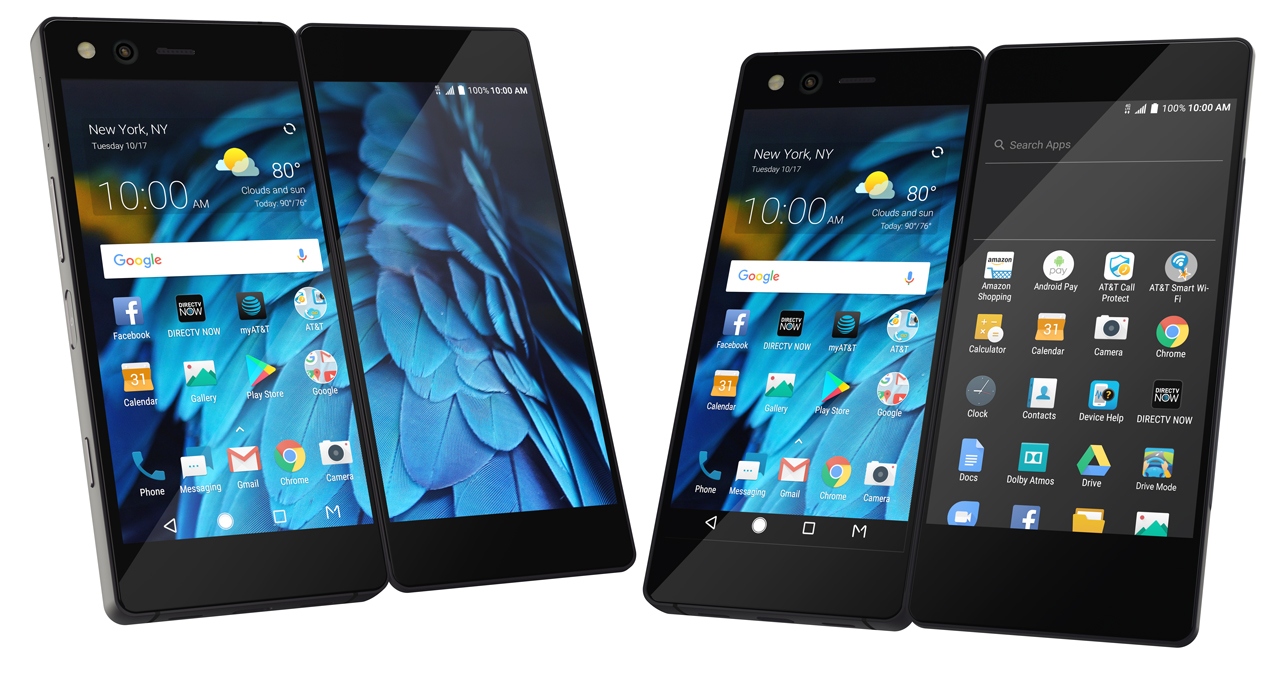
台灣有媒體報導,為了與iPhone的大屏設計有差異化,有多間包括LG、華為、OPPO、三星等在內的Android手機廠商製造商,正在有意並正研發雙屏折疊設計的手機。這種雙屏折疊設計,並非傳統功能手機的折機,而是與中興ZTE早前在日本推出的Axon M,以兩塊顯示器,可折疊與展開合屏使用的雙屏手機。

華為消費者業務CEO余承東


根據報導,華為消費者業務CEO余承東,就表示公司正開發雙屏手機,並預計2018年底前將這款商品推出。而三星方面,也曾在美國提交有關折疊智能手機的專利申請。至於國內方面,消息人士指包括OPPO在內的廠商,也正在積極申請有關的專利。

海信 A2 Pro
HTC U Ultra副屏

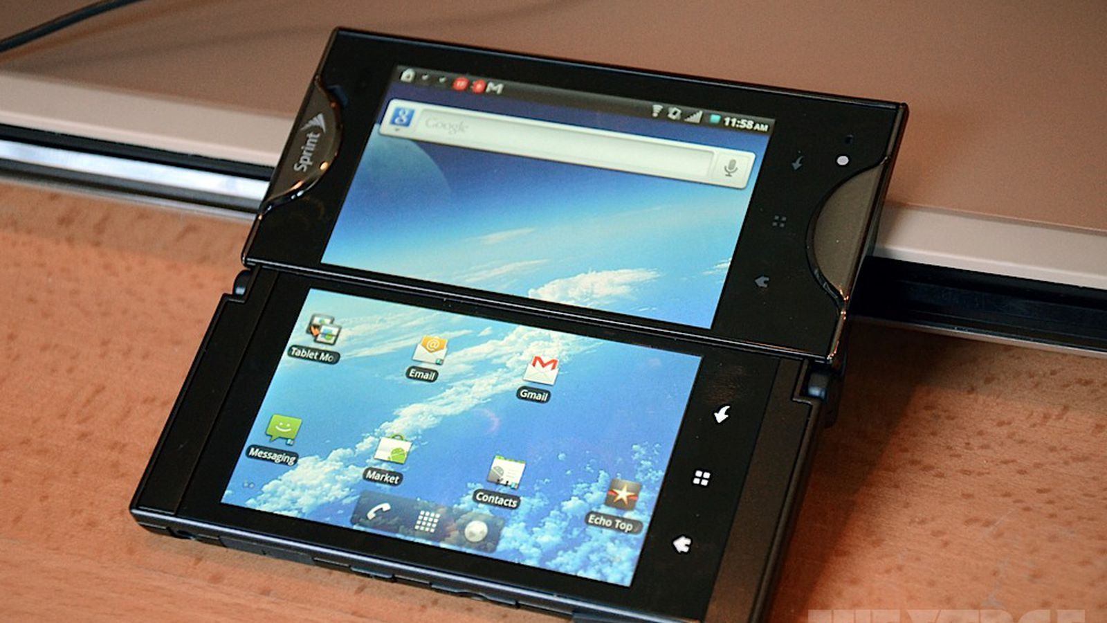
對於雙屏手機,現時設計主要以主與副屏設計的組合設計,例如LG V系列或HTC U Ultra,後者有一小塊2吋的副屏,或YOTA Phone或海信A2的彩色主+水墨屏E-Ink副屏。而本文的多屏折疊手機,與2011年時日本京瓷曾經推出Kyocera Echo手機接近。當時Kyocera Echo以旋轉鉸鏈,將兩塊3.5吋WVGA觸屏連接。當也與ZTE的Axon M一樣,展開時,兩屏幕的縫隙位的粗邊,會讓人難以接受。


2011年推出的Kyocera Echo手機,以旋轉鉸鏈連接兩塊3.5吋屏幕


來源:digi times

benny

熱愛電玩、足球及賺錢,個性貪玩,做事認真。為了買遊戲及玩樂花費,畢生鑽研投資理財之道,曾全職打機一年,想做就去做。